25 creative techniques to make brochures pop
Posted by staff / February 25, 2015
When carefully crafting a piece of marketing material like a brochure, the last thing you want is for your target audience to see it as no more than an impromptu fan or piece of scrap paper, but, unfortunately, it happens all too often.
To get your audience to sit up and take note, great design is the key to garnering attention, and there’s no better way to do it than tapping a few of these twenty-five creative ideas presented by Canva’s Caitlin Jordan.
01. Think simple.

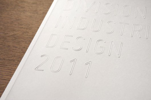
Simple design can be incredibly effective and doesn’t have to be boring. In this brochure, the title is embossed in a simple, clean typeface on a white background. The effect is very clean and modern, and though there isn’t much contrast it still translates well. The embossing also adds an interesting texture to the brochure, and can be carried throughout the interior.
02. Consider functionality.

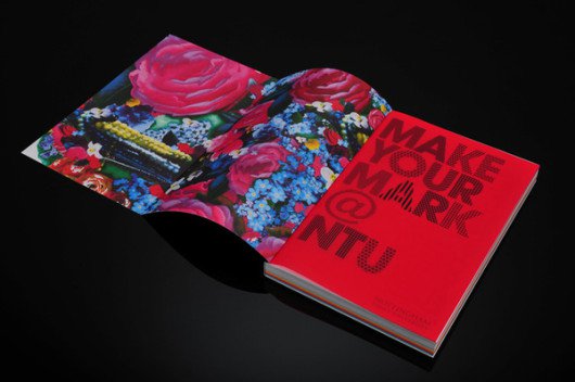
At first glance this brochure looks simple enough. A thick book full of information. Once it’s opened though, the cover is folded out and reveals a beautiful floral pattern that complements the bright red of the introductory page. Small surprises for your viewers can make a big impact, even if it’s as simple as hiding away pretty flowers.
03. Create impact with simple shapes.

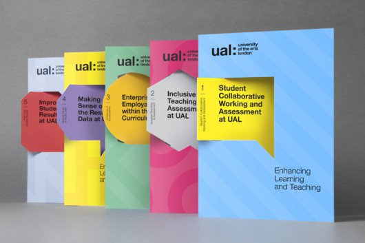
Geographic shapes made to look like callouts have a fun effect on these brochures. The pop of color against the background helps to bring the message forward, as if it really is calling out. The cuts also create a cool three-dimensional look, adding yet another element of interest.
Full story at Canva.
Graphics credits: Canva
[…] To get your audience to sit up and take note, great design is the key to garnering attention, and there’s no better way to do it than tapping a few of these twenty-five creative ideas presented by Canva’s Caitlin Jordan. Read more… […]
Why the F**K do I need to sign up to read the F**KING ARTICLE?!!
Dear Mrs. Belle, first, it’s not nice to curse people who are giving you something for free to help better your business. Second, it’s only fair that you do a little trade for their intellectual property. Be nice. Cheers!