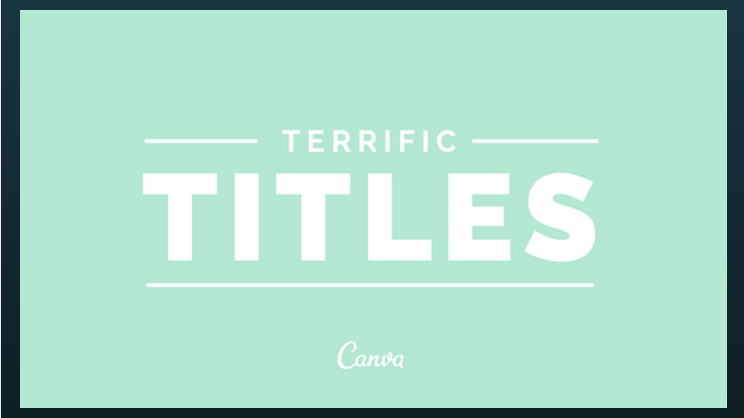
5 tips for creating eye-catching titles
Posted by staff / October 20, 2014
Appealing wording is one way to grab your audience’s attention with a title, but another is framing it in just the right way to add visual appeal to your blog’s arsenal.
Canva’s Anna Guerrero offers five tips for creating terrific title graphics to complement your crafty wordplay, so readers won’t be able to resist diving into the content.
1. Center align your title
- Make your title the central focus of your design by aligning it in the centre of your composition.
- This works well with background images that aren’t too busy. For example, see the clear ocean image above.
2. Right align your title
-
Copy space refers to empty areas in your images that are ideal spots to place text. The image above is a great example of this – see how it provides an opportunity to right align text effectively.
-
Try adding a line underneath your title or subtitle to create emphasis.
Full story at Canva.
Graphics credits: Canva


Great tips. I recently added Canva into my posts and my followers are so thankful. <3