50 color schemes to set the tone of your website
Posted by staff / January 30, 2016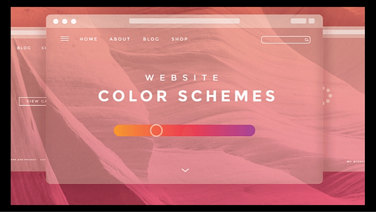
You’ve never seen a kid’s website done in black, white, and shades of grey because those aren’t the colors that appeal to that particular audience.
Color immediately sets the tone for your brand before a single piece of copy is read or link clicked, so if you’re stumped as to how to choose the right palette, one of the fifty curated by Canva Design School‘s Mary Stribley is sure to fit the bill.
Muted Tones
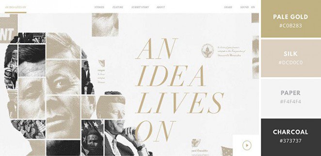
This striking website design by The Martin Agency uses muted gold and off-white tones contrasted against sharper blacks and whites to create a stunning contrast. Simple, minimal, and elegant, this palette is perfect for any sophisticated design you may embark upon.
Warm and Bold
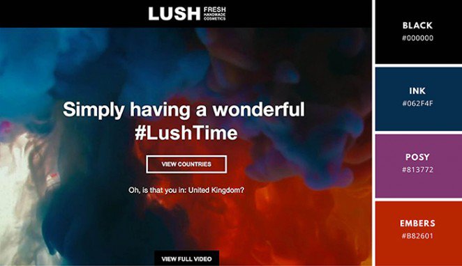
Fancy mixing warm and cooler colors to create a unique vibe? Take a leaf from Lush Digital’s book — pair vibrant reds and blues with darker indigos and purples for a dreamy, bold effect.
Unexpected Color Combinations

Purple and green aren’t two colors that are often mixed, but this site by Intesys S.r.l. proves that maybe they should be. The rich purple color contrasts strikingly against the vibrant lime and sharp whites to create a unique and memorable site design.
Full story at Canva Design School.
Graphics credit: Canva
Comments are off for this post.