50 offbeat resumes that stand out from the pack
Posted by staff / February 21, 2015
Times have certainly changed for the humble resume and, no wonder, considering the remarkable design tools now available to highlight your skills and experience like never before.
Canva’s Janie Kliever found fifty examples of CV’s and resumes just begging to be read, and offers tips that can be learned from each.
Of course, it’s important to know the expectations of your industry, so tread cautiously, but a few changes could get that toe in the door.
01. Start It Right
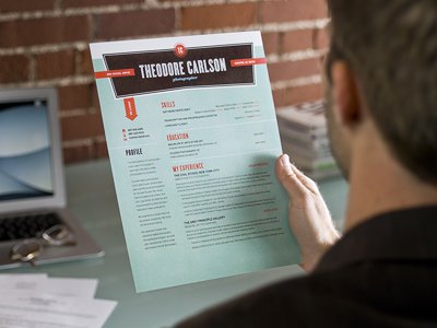
Starting off your resume strong with a bold header, like in this design by Shed Labs, draws attention to your name and makes it more memorable. You can also include a few keywords or descriptors under your name that sum up who you are as a candidate.

02. Space It Out
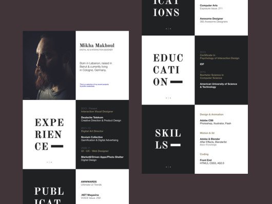
This chessboard-style layout is certainly striking, giving each category its own distinct space. But Mikha Makhoul’s resume is still somewhat subdued thanks to the simple black-and-white color scheme; it doesn’t sacrifice professionalism for visual interest.

03. Make It Pop
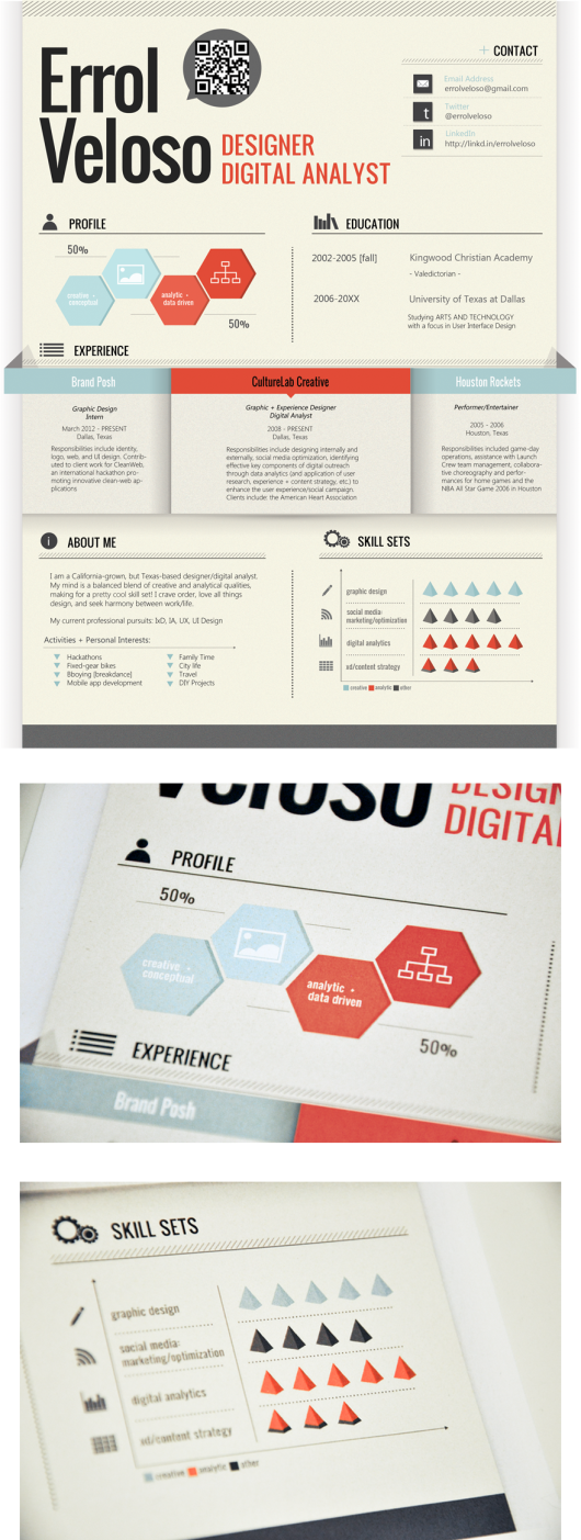
Some well-placed shadows can make your resume pop, literally — giving it a 3D appearance and creating the illusion of depth.Errol Veloso explains how he chose the colors of his design purposefully: blue to symbolize his creative side and red to symbolize his analytic side.

Full story at Canva.
Graphics credits: Canva
Comments are off for this post.