50 stylish ideas for stand-out business cards
Posted by staff / August 20, 2015
No matter how many LinkedIn connections you have or Google Hangouts you attend, a stunning business card is still an asset in the world of in-person networking.
Rather than getting shuffled to the back of the wallet with nary a glance, make an unforgettable first impression using one (or several) of these eye-catching design elements explained by Canva Design School.
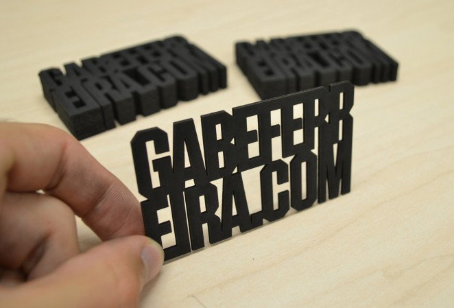
Cut it Out!
Add some edge to your next business card and leave them off altogether. That’s what Gabe Ferreira did with the design for his own business cards, and the result speaks for itself.
Be Abstract
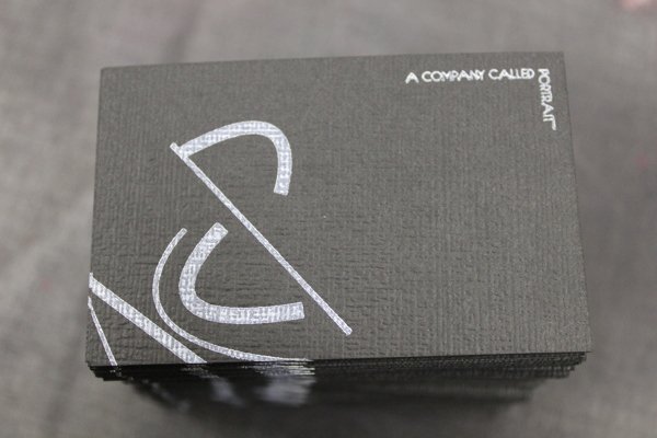
Flirt with reality and show your business runs deeper than the competition.Kate Clift does it perfectly here. By composing shape, color and form she creates a wonderful piece of abstract, business card art.
Glow in the Dark
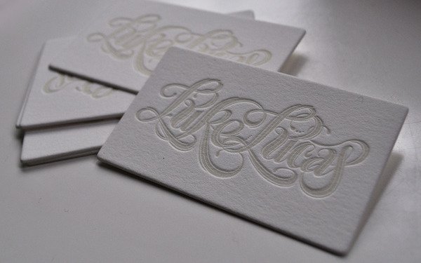
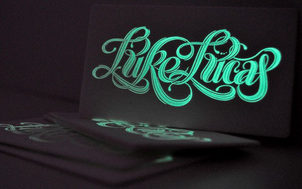
How many business cards have you handed out after hours? Luke Lucas, a designer from Sydney commissioned a letterpress design that incorporated cotton stock with phosphorescent ink so that it illuminates in the dark.
Full story at Canva Design School.
Graphics credit: Canva
Fad novelty business cards do not cut it…never have. Form follows function; far too many designers forget this fundamental principle. Dramatic simplicity still rules in communication effectiveness.
I still prefer a business card with the person’s picture . The visual reminder of the face works best for me.