71 eye-catching ads to inspire your next campaign
Posted by staff / March 22, 2015
Everywhere you look, advertisements are there, so ubiquitous that you barely notice many of them.
While this kind of ad-blindness is great for the over-stimulated consumer, it’s not so good for the companies trying to get their attention, so Canva’s Melanie Biehl collected and analyzed seventy-one great examples of advertising that both catches the eye and draws in the target audience.
01. Allow location to be part of your design inspiration.
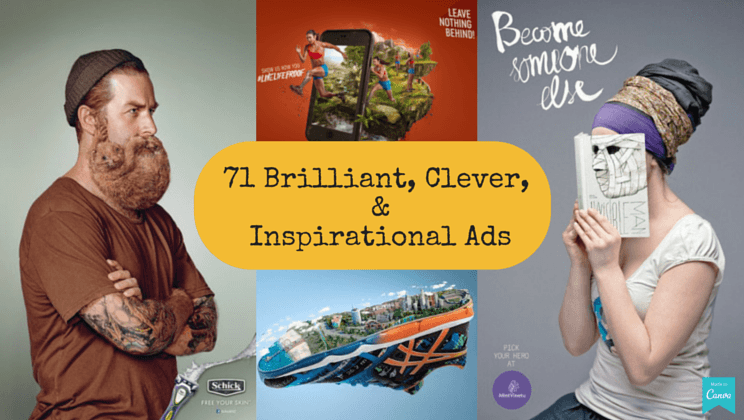
ASICS worked with VITRO on their sponsorship of the 2015 Los Angeles Marathon, which included a beautifully produced image of key L.A. landmarks by Stuart Rowbottom and Mike Campau. Dodger’s Stadium, the Downtown LA skyline, the HOLLYWOOD sign, the Capitol Records building, Chinatown, The Beverly Hills Hotel, and the Santa Monica Pier were all represented on the bottom of an ASICS shoe.

02. Juxtapose imagery to trick the eye.
Love Agency’s striking “Become Someone Else” campaign for Lithuania’s Mint Vinetu Bookstore blends the faces of the readers with nearly sinister book covers.

03. Show don’t tell.
DDB Brazil created this simple but effective campaign for FedEx, using continental maps on buildings to get their message, and their package, across.

Full story at Canva.
Feature graphics credit: Canva
‘Show, don’t tell’ has been a mantra not only for advertisers but also for fiction writers, feature film copy-writers and others engaged in drawing attention of the viewer.
In fact, wherever the advertisement has been able to ‘show’ more than ‘talk / tell/ force the viewer to read’, the result has been better, both in terms of calling attention and call to action.