A history of NYC as seen in 15 subway maps
Posted by staff / September 3, 2013 GizmodoMassimo Vignellisubway maps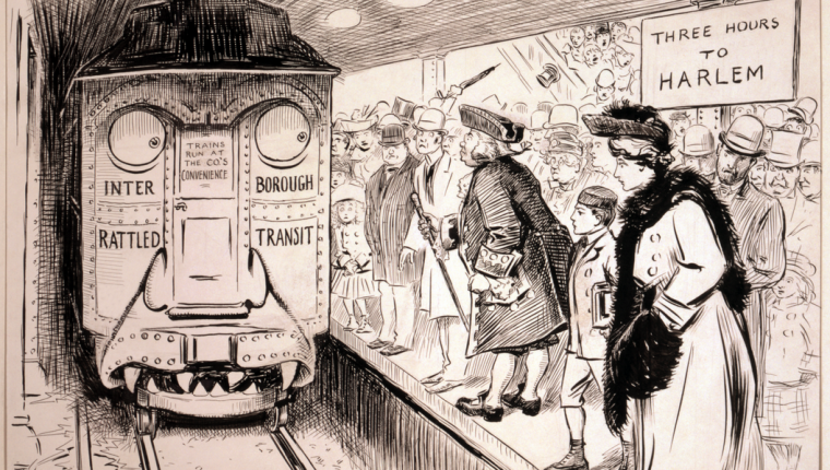
How cool is this – and from the New York Subway archives. Gizmodo has collected 15 subway maps, used in the past, to piece together snapshots of life in the Big Apple over the years. The maps illustrate more than the paths of the trains: they illustrate the technology and styles of the times.
The subway map we all know today was designed in 1972 by Massimo Vignelli, an Italian-American designer whose gem-colored diagram eschewed geographical honesty for visual clarity. At the time, Vignelli’s elegant Modernist diagram pissed a lot of New Yorkers off. “A lot of people love it,” he said thirty years later. “And a lot of people hate it, too, by the way.” But time heals all wounds, and today, Vignelli’s Helvetic-swathed iconography graces everything from shirts and mugs to tattoos and children’s books. We’ve grown to love it.
So what did the New York subway system look like before Vignelli gave it a rational voice? Well, for one thing, it appeared far denser and more difficult to read. But those early maps also held a mirror up to the technological and design currents in the world at large. The ways in which information was conveyed were changing rapidly in the first half of the 20th century: From the way printing presses worked, to the development of san serif typefaces, to a revolution in how graphic designers thought about communicating through images.
For a look at New York City’s history as seen through the subway map, see here: Gizmodo.
Photo credit: Rogers, W. A. (William Allen), 1854-1931, artist. Image in the public domain.
Comments are off for this post.