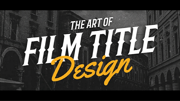
Explore a century of film title design
Posted by staff / December 9, 2015
The first glimpse an audience sees of a film is the film title sequence, and graphic design plays a huge role in setting just the right tone.
Though the earliest days of film relied on simple design that had to both introduce the film and narrate it, as fashion and technology changed, so did film title design, where some of history’s great graphic designers got their time in the spotlight.
Canva Design School’s Rebecca Gross looks back in a post that will definitely appeal to the film lover in you.
Narrative function
By the mid-late 1930s, film titles started serving a narrative function and were designed to prepare the viewer for the mood and story of the film.

The My Man Godfrey (1936) and Show Boat (1936) film title sequences both establish a mood for the film by integrating typography with storyline. In My Man Godfrey the camera pans across the names displayed like neon signs on city buildings,while Show Boat features a revolving model of cut-out figures that support overhead banners presenting the film’s credits…
Clean, geometric forms
Graphic design during this period – and subsequently film title design – maintained an aesthetic defined primarily by symbolic geometry, clean typography and bold graphic forms.

Bass’ title sequence for the original Oceans Eleven (1960) is classic Vegas with lots of noise and color. Inspired by Vegas’ bright lights, Bass created a dot motif to evoke the imagery and signage of the Strip…
Full story at Canva Design School.
Graphics credit: Canva
Comments are off for this post.