Sign of the times: how 40 brands changed their look
Posted by staff / June 28, 2015
Just because your brand survives a century doesn’t mean its look stays stuck in the past. Changing styles, looks, even political situations impact the desired image a company projects to stay current in an always competitive market.
Canva Design School examines how forty iconic companies changed their stripes over time to identify what branding looks like in the modern age.
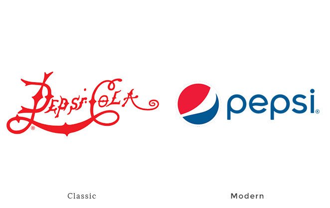
Pepsi-Cola founder Caleb Bradham scribbled the first company logo in script. Pepsi progressively simplified the logo to take a more minimalist approach while still retaining some of the script-like curves of the original logo.
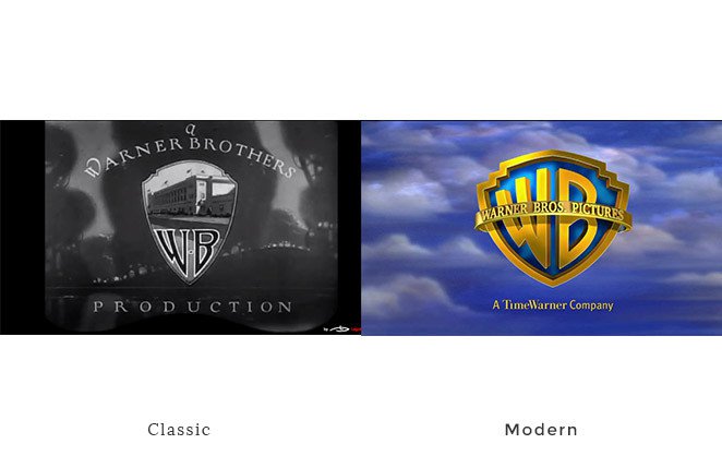
The Warner Bros. logo has never strayed far from its 1923 conception. The first logo featured a photo of the studio in the iconic shield in a decade that films really found their place in popular culture. Over time, Warner Bros. reflected changes in the movie experience – such as colour and 3D effects – in the logo.
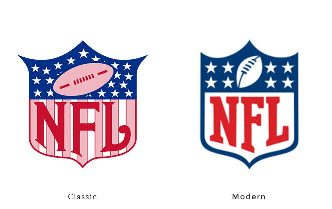
When you’re on to a good thing why change? That’s obviously the attitude of the NFL that has been working this logo since 1940. Red, white and blue is patriotic as are the stars. The stripes disappeared in the 1960s making the logo easier to reproduce and transmit electronically.
Full story at Canva Design School.
Graphics credit: Canva
Comments are off for this post.