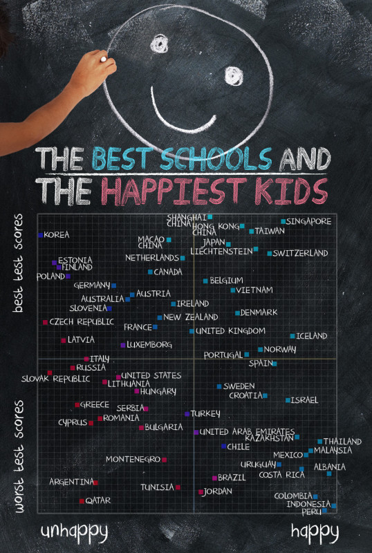
The world’s best schools and happiest children [infographic]
Posted by Josh Taylor / January 22, 2014 infographicworld's best schools
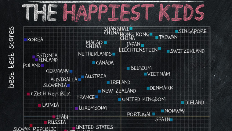
We’ve all seen those lists of internationally top-performing schools or happiest students. I like this graphic because it puts those two lists together into one helpful chart. Those of you reading from the United States, prepare to be bummed out:

Full story at Cool Inforgraphics, via Buzzfeed.
Photo credit: Buzzfeed
As with any infographic, always question the data sources and methods. However, if this chart is accurate, it means that the United States government and its various states are potentially misspending great sums of money on “improving” public education.
A Combination of clear thought and image will present in good manner helping to pass subject with effective manner. infographic is way to present thought with graphical presentation is easy to understand and analysis about it.