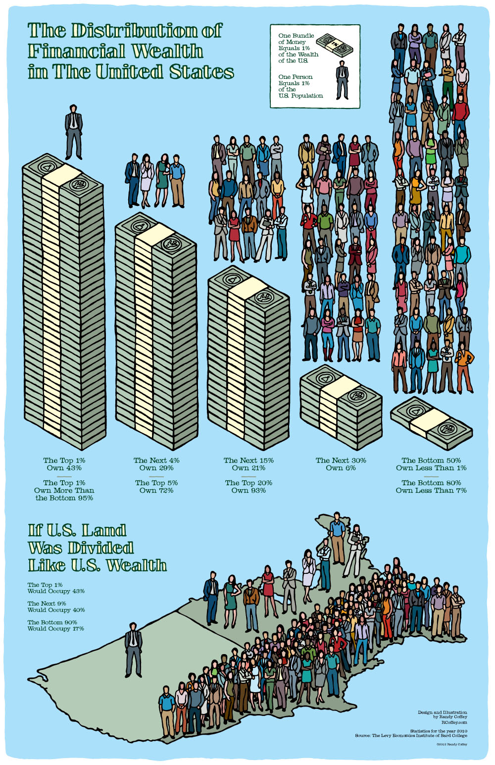
What wealth inequality actually looks like [infographic]
Posted by Josh Taylor / March 9, 2014 infographicwealth inequality
We hear a lot about the income gap in America, but it sometimes seems pretty vague. This infographic helps make the situation abundantly clear.
Full story at Upworthy.

Comments are off for this post.